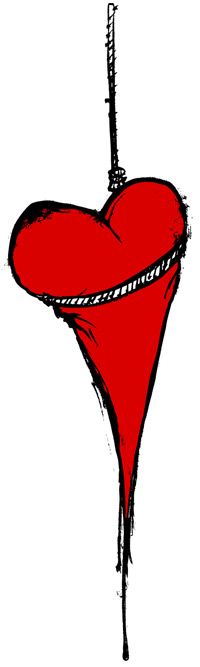
As many of you have seen this before, this has been a staple icon for The Used for over 5 years, and I couldn't be more proud to have something that I designed represent them so steadily for that long. Now grab your rotary phone, call up Ol' Crazy Doc Brown, scoop up your Valterra skateboard, jump in your Delorian and set the date to March 1, 2010.
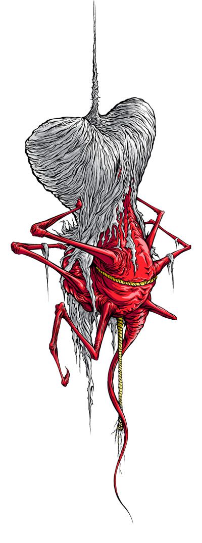
Last week I got the chance to catch up with the guys, and we all agreed that so many things have changed in all of us over the course of those 5 years, that it was time for a little remodeling. More specifically, in the Heart Department. Once again, we played creative ping-pong for a few days and then, just like old times, decided on a good direction and I went off and ran naked through a field of sketching. And the final result is a nice little rebirth of the old logo. So here it is, my new updated logo for The Used:
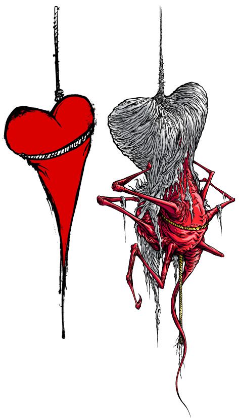
And for an evolution of the old and the new, here they are holding hands:
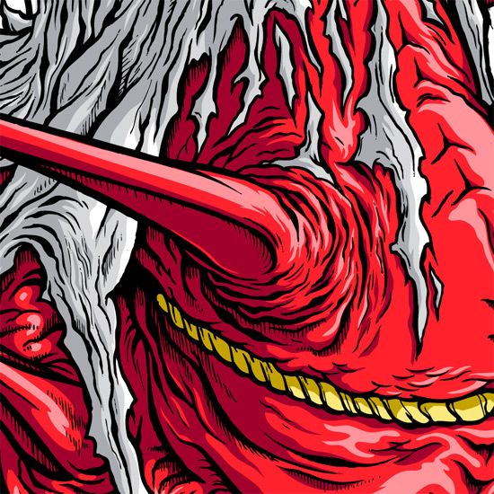
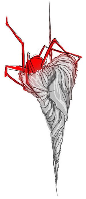
And lastly part 1, a little detail:
And lastly part 2, the original really rough concept sketch:
Word.
Oh, and it looks like you can already buy a shirt with this new logo on it ONLINE AT THE USED'S MERCH STORE!